One map for each chapter. Locate the story before explaining it.
Chapter 1
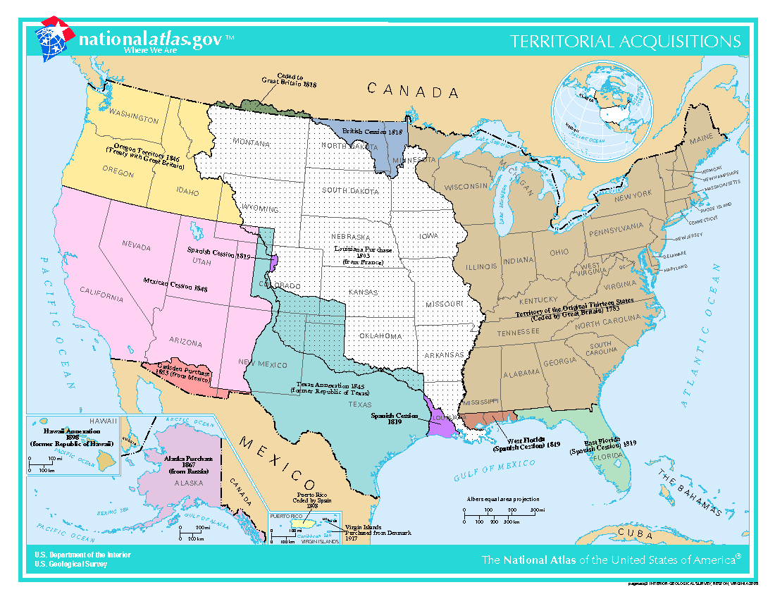
U.S. Territorial Acquisitions
Public domain — U.S. government work.
U.S. Department of the Interior / National Atlas of the United States · Modern reference map; acquisitions through 1917 · Reference map
The United States took its present shape through a series of territorial acquisitions. Read this map alongside Takaki’s opening question about whose experiences belong in the story of America.
Look closely: Which large acquisition includes places where Native nations or Mexican communities were already living?
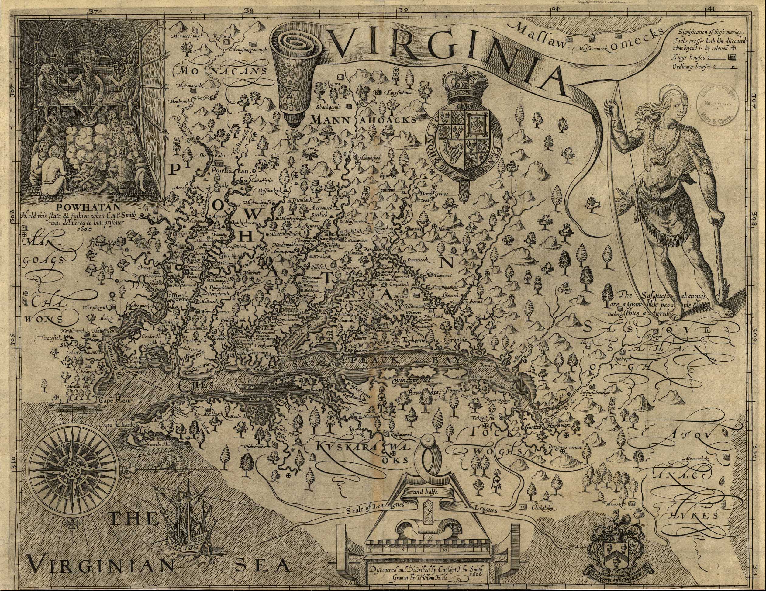
John Smith; engraved by William Hole · 1612 · Primary-source map
Smith’s map names Native towns around the Chesapeake and includes an image of Powhatan’s court. Its English colonial viewpoint offers evidence for examining the chapter’s language of civilization and conquest.
Look closely: What do the many Native place names reveal about the land the English claimed?
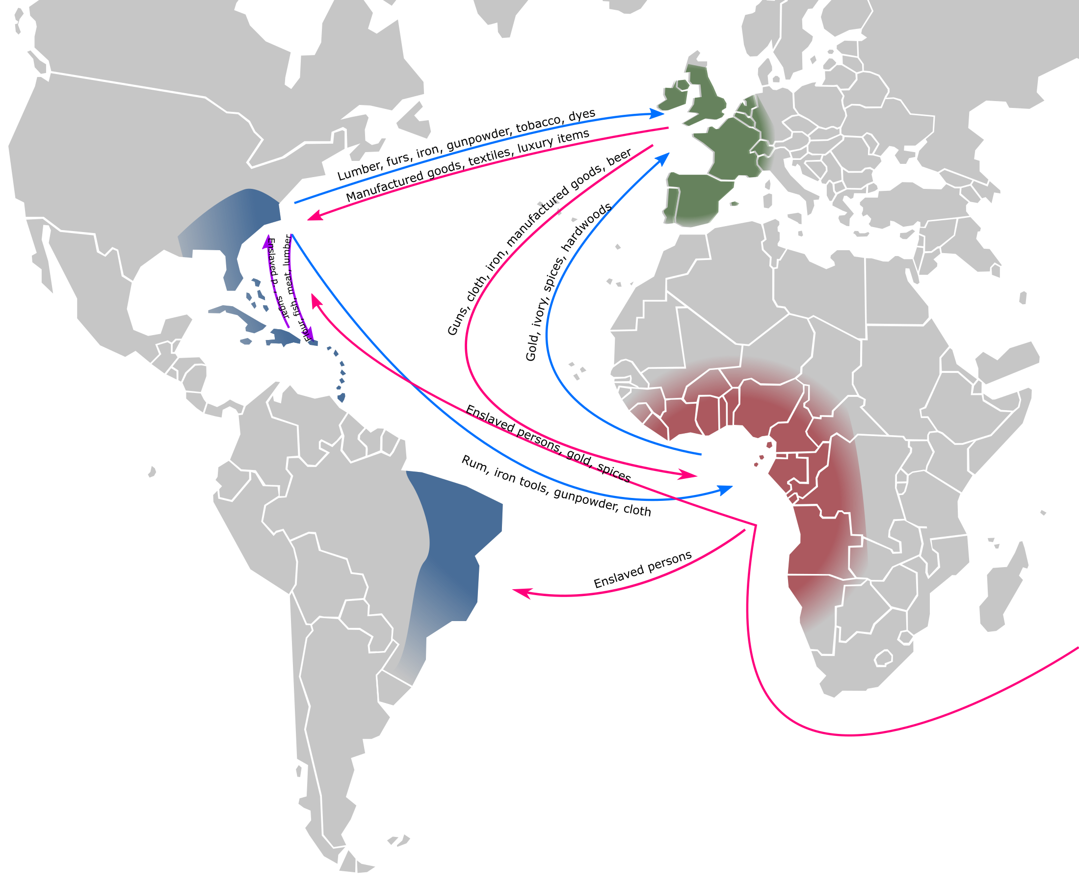
CC BY-SA 3.0 — credit Isaac Pérez Bolado and Jkwchui; image unmodified. https://creativecommons.org/licenses/by-sa/3.0/
Isaac Pérez Bolado, based on a map by Jkwchui · 2020; depicts the 1500–1800s · Reference map
This overview connects European commerce, African captivity and plantation production in the Americas. It places colonial Virginia within the wider economy behind the chapter’s account of slavery’s construction.
Look closely: Trace the Middle Passage: what other movements of goods depended on the forced movement of people?
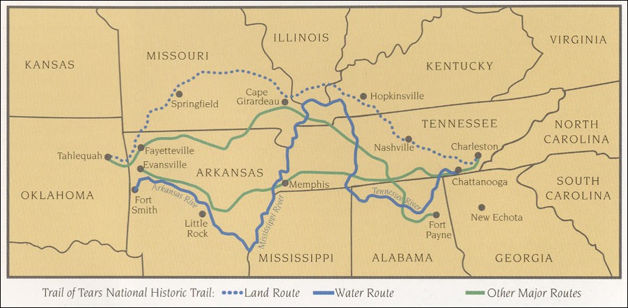
National Park Service · Modern reference map; depicts removal in the 1830s · Reference map
The routes turn the policy of removal into a journey across actual places. Follow the Cherokee routes west while reading about the loss of Native homelands and the human consequences of federal policy.
Look closely: Which rivers and present-day states lay between the Cherokee homeland and Indian Territory?
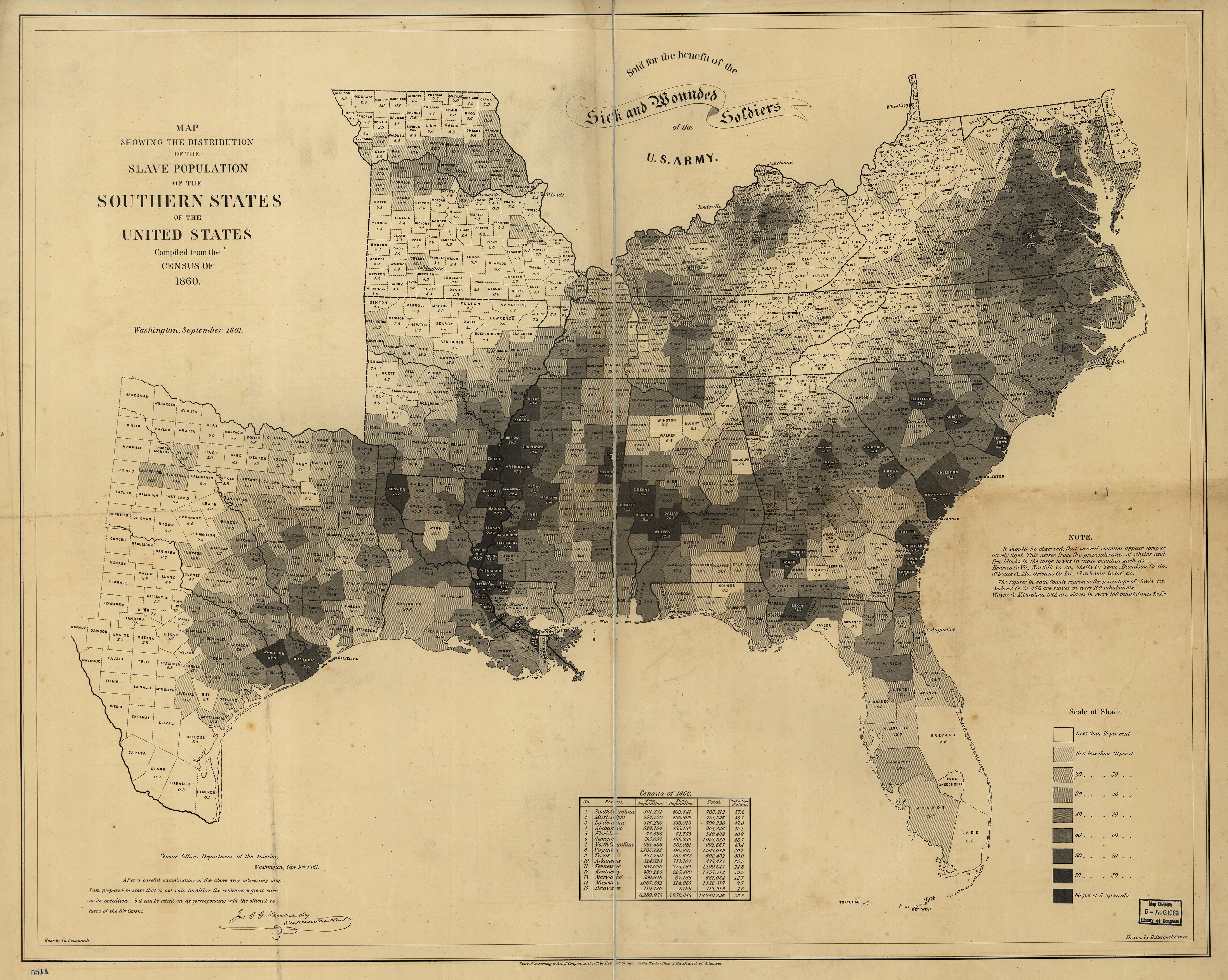
Public domain — U.S. government work; Library of Congress original.
Edwin Hergesheimer, U.S. Coast Survey; engraved by Th. Leonhardt · 1861; based on the 1860 census · Primary-source thematic map
Each county is shaded by the percentage of its population held in slavery. The pattern helps students locate the plantation regions behind the chapter’s account of labor, wealth and life under slavery.
Look closely: Where are the darkest counties concentrated, and what physical features connect them?
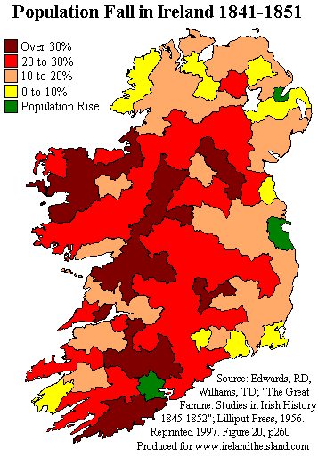
Public domain — released by Patrick Abbot / Wesley Johnston.
Patrick Abbot / Wesley Johnston · Modern reference map; 1841–1851 census interval · Reference map
The colors show uneven population loss across Ireland during the decade of the Great Famine. This provides a geographic starting point for the chapter’s account of why Irish people left their homes.
Look closely: How does the population loss in western Ireland compare with the area around Dublin?
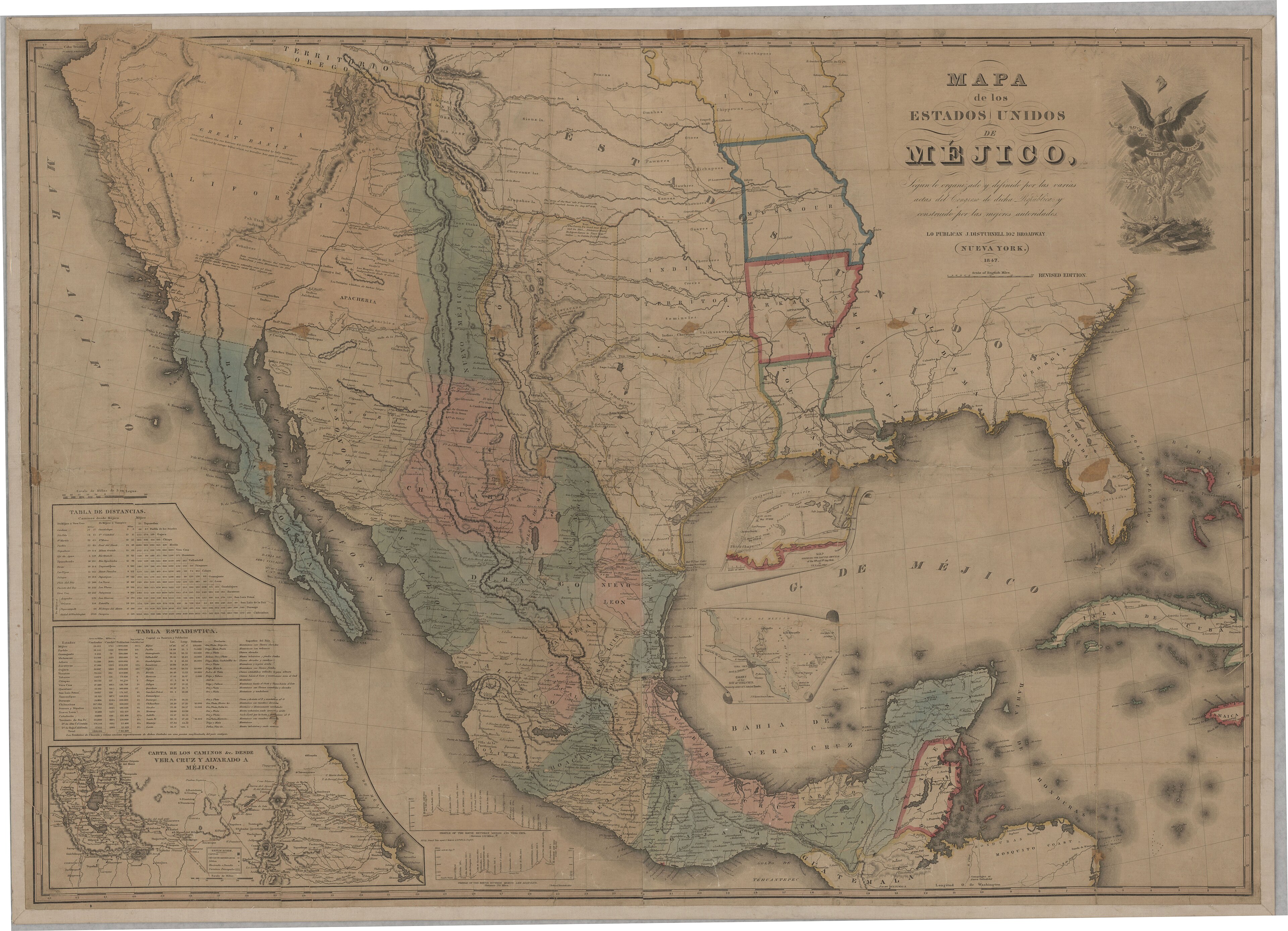
Public domain — 1847 map; National Archives original.
John Disturnell · 1847 · Primary-source map
Published during the U.S.–Mexico War, Disturnell’s map became a reference for the treaty boundary. It helps locate the communities whose lives changed when the border moved.
Look closely: Find Alta California and Nuevo México: how does this map differ from today’s U.S.–Mexico border?
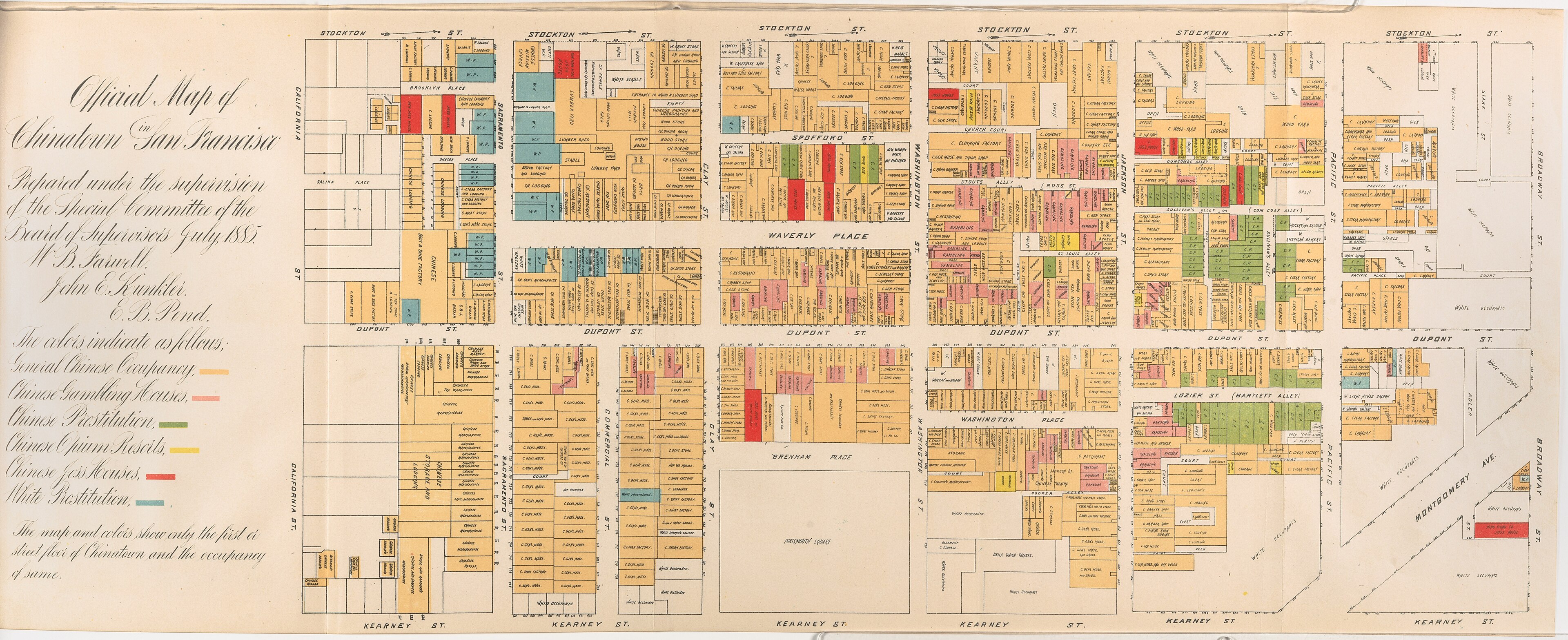
Public domain — copyright expired; Cornell University Library, PJ Mode Collection.
Willard B. Farwell; San Francisco Board of Supervisors · July 1885 · Primary-source thematic map
Created for an official report hostile to Chinese residents, this map classifies Chinatown’s buildings and activities. Its legend is evidence of the racial assumptions that accompanied exclusion.
Look closely: Which categories in the legend reveal the mapmakers’ priorities or biases?
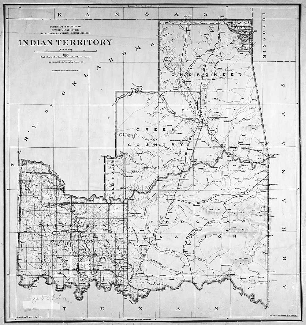
Public domain — U.S. General Land Office; National Archives, Record Group 49.
U.S. General Land Office · 1891 · Primary-source map
This government map records territorial divisions during the allotment era. Read its boundaries beside the chapter’s account of policies aimed at breaking up Native landholding and communities.
Look closely: Which Native nations are named, and where do you notice different kinds of territorial boundaries?
Public domain. Sanborn Map Company, November 1914; Library of Congress Geography and Map Division, via Wikimedia Commons.
Sanborn Map Company · November 1914 · Primary-source map
This fire-insurance map places a sugar mill, cane fields and Japanese community institutions in the same small Hawaiian town. It gives a local view of the plantation world behind the chapter’s “money trees.”
Look closely: Locate the sugar mill and Japanese schools: what do you notice about their locations?
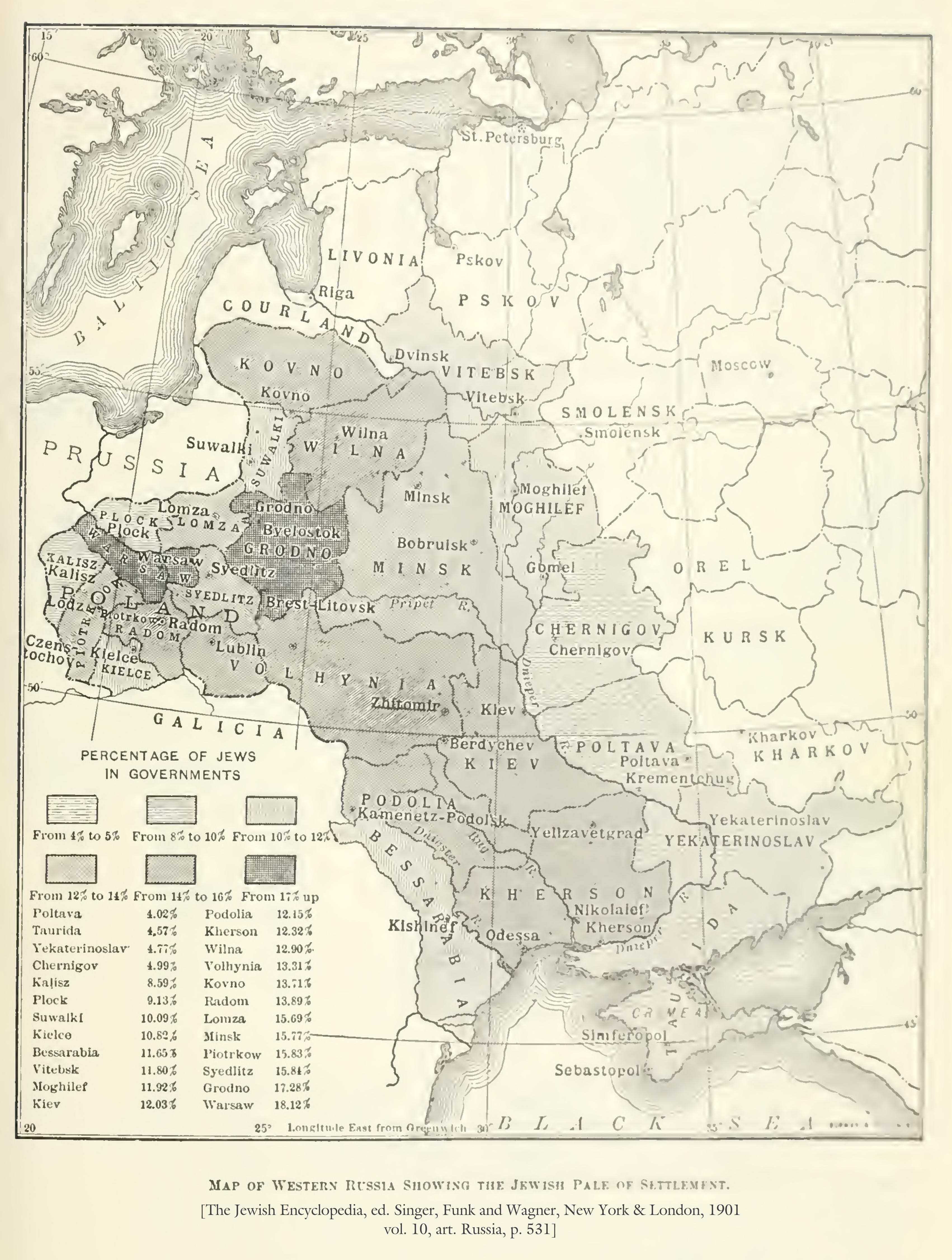
The Jewish Encyclopedia, published by Funk & Wagnalls; cartographer uncredited · 1905 · Primary-source thematic map
Shading shows the Jewish share of the population in the Pale of Settlement and neighboring Congress Poland. The map situates the communities discussed in the chapter’s account of restrictions, persecution and emigration from the Russian Empire.
Look closely: Where are the highest percentages concentrated, and what boundaries surround those areas?
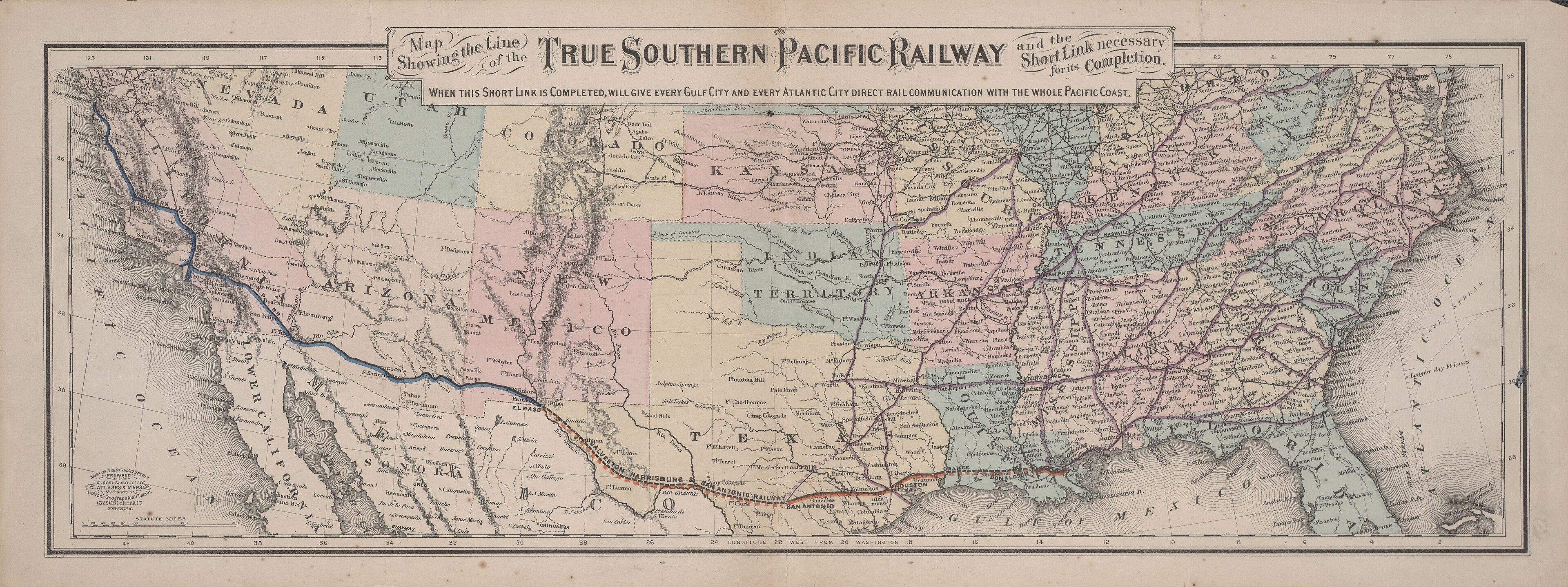
Public domain — copyright expired; University of Texas at Arlington Libraries Special Collections.
G. W. & C. B. Colton & Co. · Circa 1881 · Primary-source map
This railroad map shows the growing connections across the U.S. Southwest, including a still-unfinished link in Texas. These routes help explain the transportation network later used by Mexican workers and labor recruiters.
Look closely: Find El Paso: which places would the connected railway allow a traveler to reach?
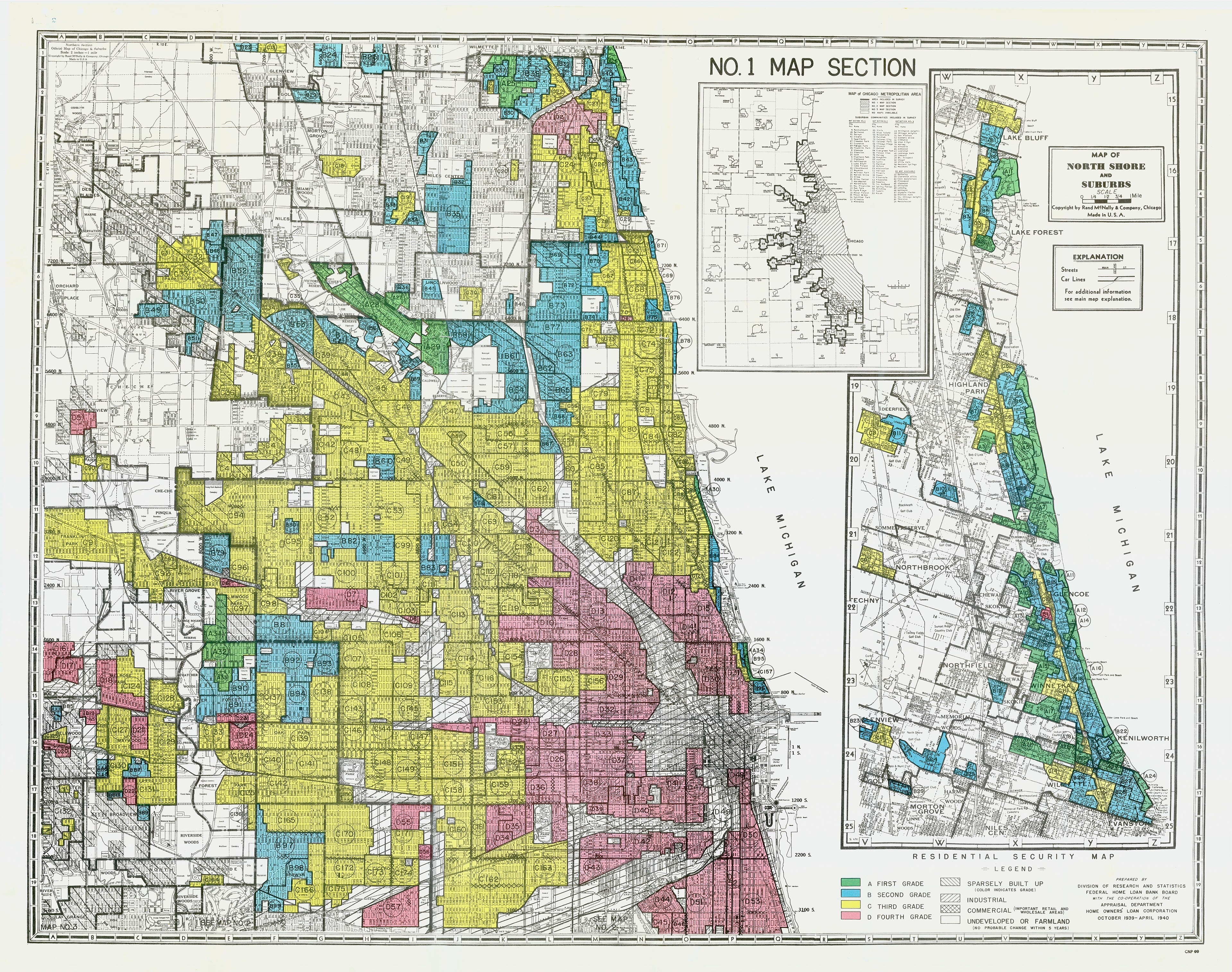
Public-domain government map; scan released under CC0 by Kara Zelasko.
Home Owners’ Loan Corporation; scan shared by Kara Zelasko · 1935–1940 survey era; digitized 2012 · Primary-source thematic map
Chicago’s neighborhoods are divided into the HOLC’s color-coded mortgage-risk grades. The map helps examine the housing barriers that Black migrants encountered in the city.
Look closely: Where do the red-graded areas cluster in relation to the lakefront and the city’s other grades?
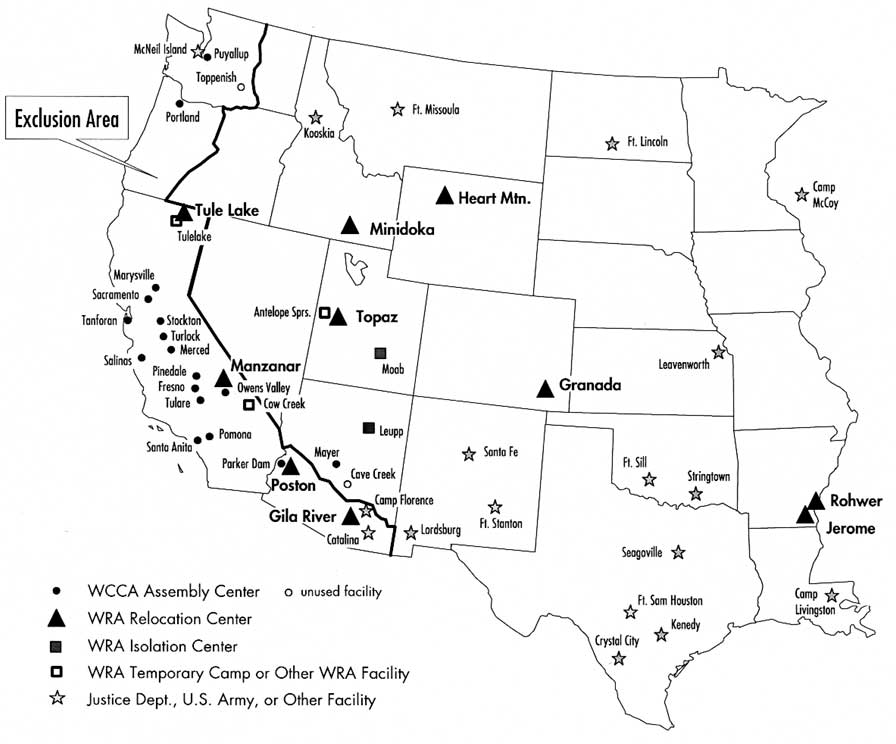
National Park Service · Modern reference map; depicts World War II · Reference map
This map locates the camps and other confinement sites used during the wartime incarceration of Japanese Americans. It makes the geography of forced removal visible as students examine whose rights were denied during the war.
Look closely: How do the locations of inland camps compare with the West Coast communities people were forced to leave?
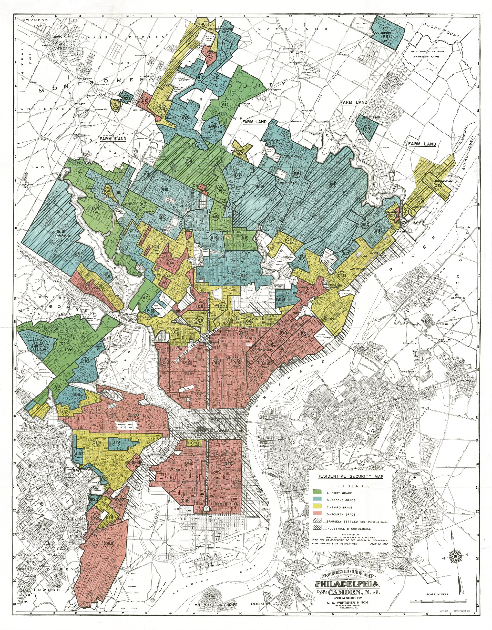
Public domain — U.S. government work; scan via Mapping Inequality.
Home Owners’ Loan Corporation · 1937 · Primary-source thematic map
Philadelphia’s HOLC map shows that the grading system seen in Chicago operated elsewhere, too. It offers a concrete link between the chapter’s calls for civil rights and demands for economic opportunity.
Look closely: What patterns or categories repeat when you compare this map with Chicago’s map in Chapter 13?
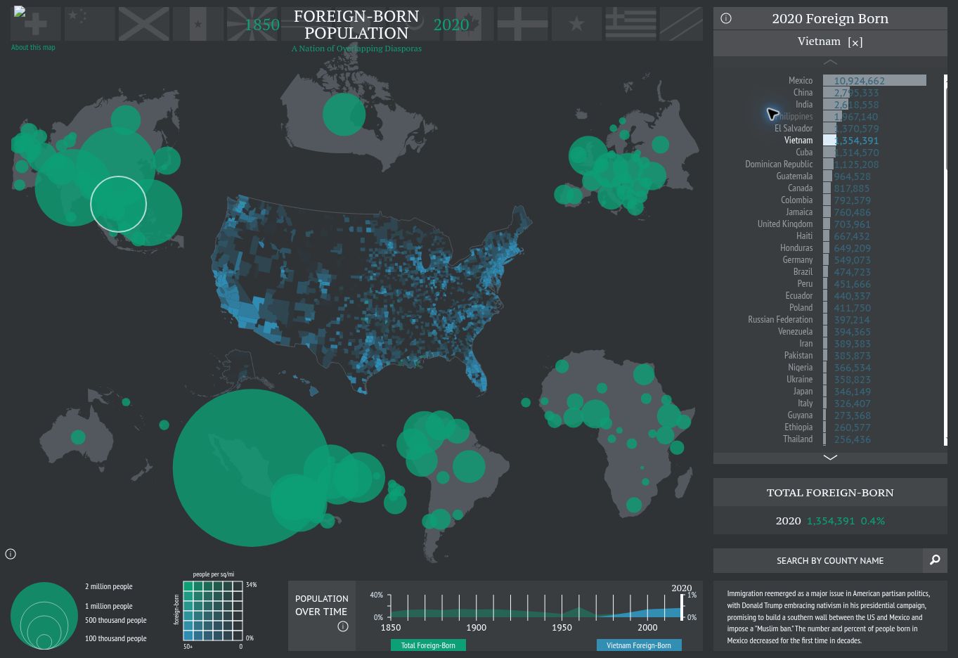
American Panorama’s 2020 census visualization with Vietnam selected; Digital Scholarship Lab, University of Richmond. Linked educational interactive; provider terms apply.
Digital Scholarship Lab, University of Richmond — American Panorama · Modern interactive map; historical census decades · Interactive reference map
American Panorama lets students select a country of birth and compare settlement across decades. Use its later decades to explore the communities discussed in the chapter on new immigration and Southeast Asian refugees.
Look closely: Choose Vietnam and a decade after 1975: where do you notice the largest clusters of Vietnamese-born residents?
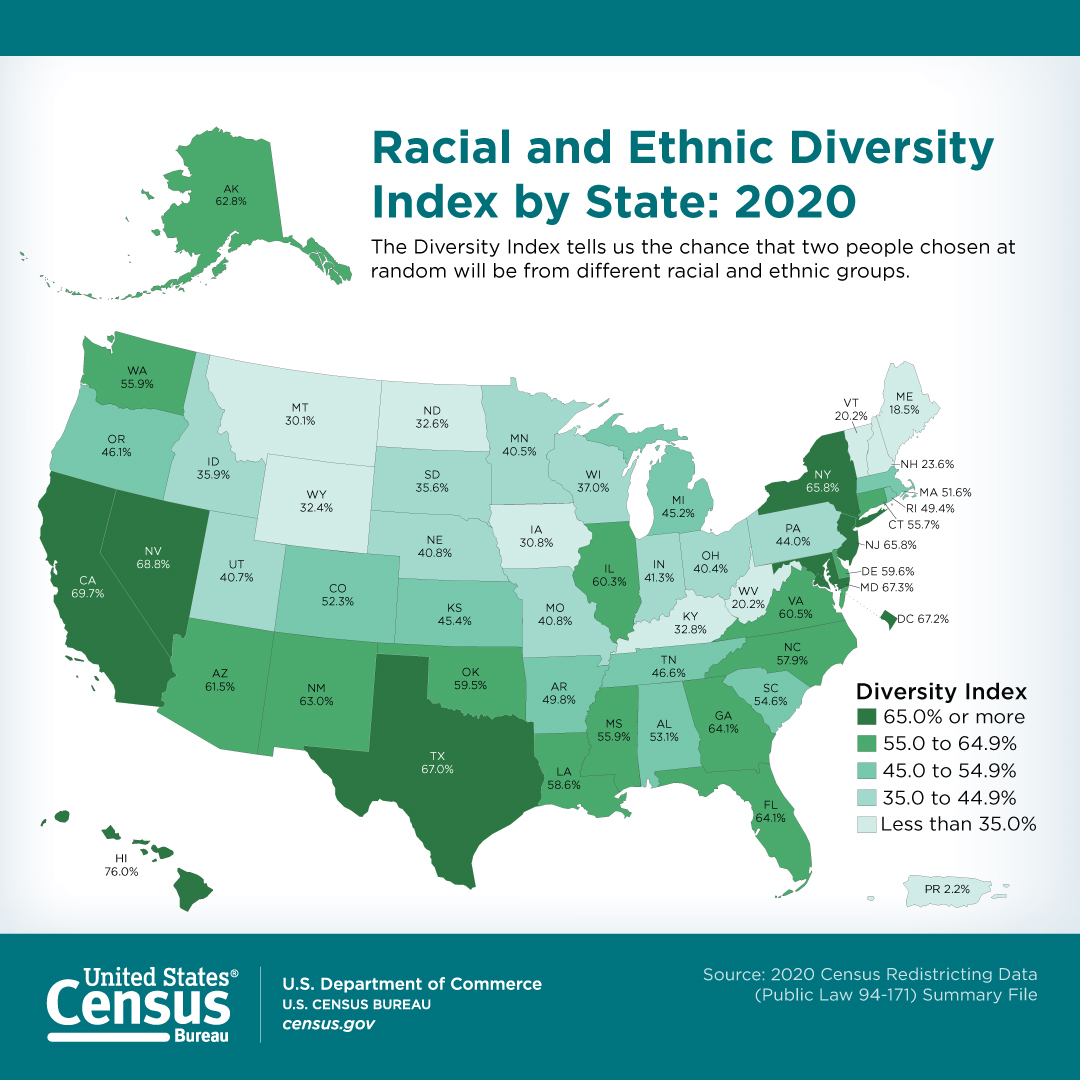
U.S. Census Bureau · August 12, 2021; 2020 census data · Reference data map
The Diversity Index measures the chance that two randomly selected residents belong to different racial or ethnic groups. Compare the variation among states while considering the chapter’s question about America’s shared future.
Look closely: How does Illinois compare with nearby states, and what can a state average leave out about individual neighborhoods?